Dedicated to making a mindful choice for our bodies and the environment.
School Project
Matcha Joy
(Packaging)
My Role
Duration
Solo Designer
1 Month, 1 Week
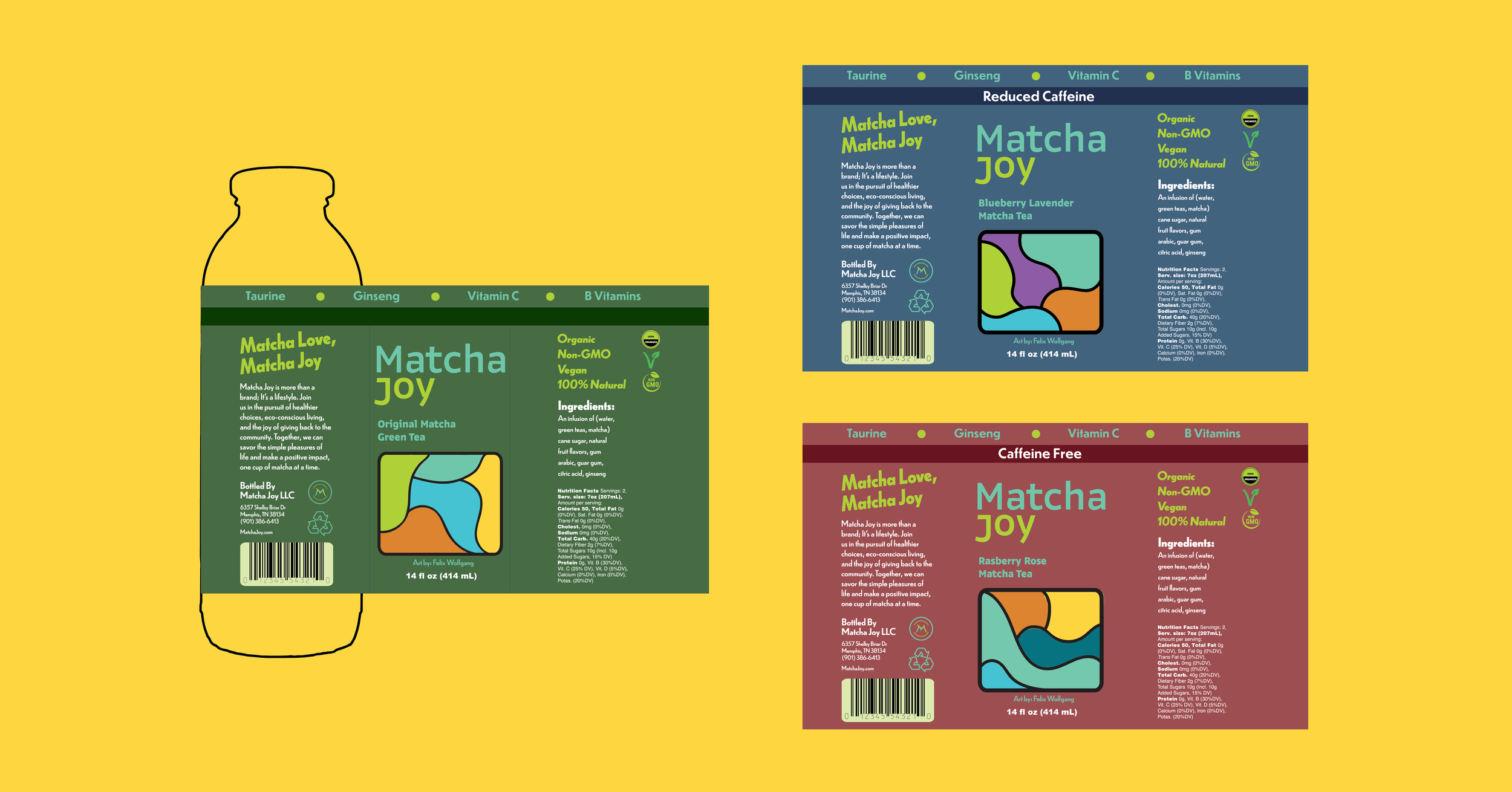
The purpose of these containers extends beyond simple packaging. They are designed not only to raise awareness for this emerging brand but also to promote a healthier lifestyle without compromising on taste. This initiative represents a move towards making mindful choices for our bodies and the environment.
Background
Project Objective
The primary objective of this project is to design and produce a series of three complementary labels for Matcha Joy and its circular containers. These labels will measure 5.64” x 8.85”, including bleed.
Solutions


Ethos
Conveys a sense of dynamism and vividness, whether referring to colors, personalities, communities, or activities. When we say something is vibrant, we imply that it is bright and striking in appearance or lively and vigorous in character.
Vibrant
Welcoming
We are committed to creating an inclusive atmosphere that mirrors the gentle embrace of matcha itself, offering a space where all can gather, relax, and find solace in the simple joy of being together over a bottle of tea.
Every aspect of our brand, from our carefully curated selection of teas to our streamlined packaging, reflects our commitment to a minimalist approach that honors the tranquility and mindfulness inherent in the matcha experience.
Minimalistic
Our matcha tea company caters to a diverse yet specific audience that values health, aesthetics, and sustainability. We attract health-conscious individuals, including millennials and Gen Z, who appreciate our minimalistic and vibrant branding, as well as our commitment to eco-friendly practices.
Target Audience
Refinement


